Equity Realty
Real Estate Website
Website Design & Development
Background
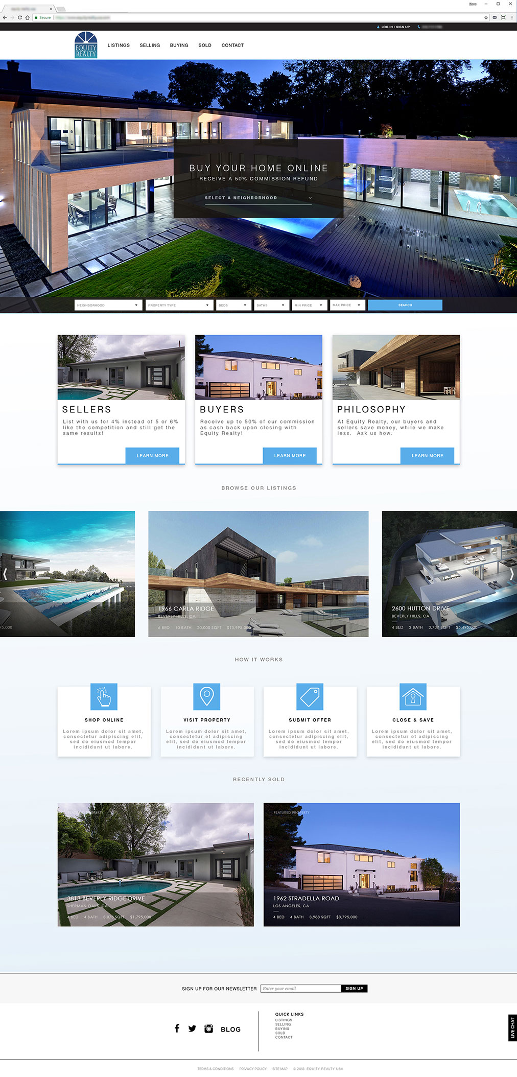
Equity Realty is a real estate company specializing in buying and selling real estate in high-end neighborhoods in the Los Angeles area. Particularly in areas like Beverly Hills, Brentwood, Bel Air, and other notable, upper-class areas. Because of this, Equity Realty needed a website that looked equally high-end. The website that was to be replaced was almost entirely informational, lacking high-quality photography and a design to match. With that, I set off to design a site that would scream professionalism.
Technology
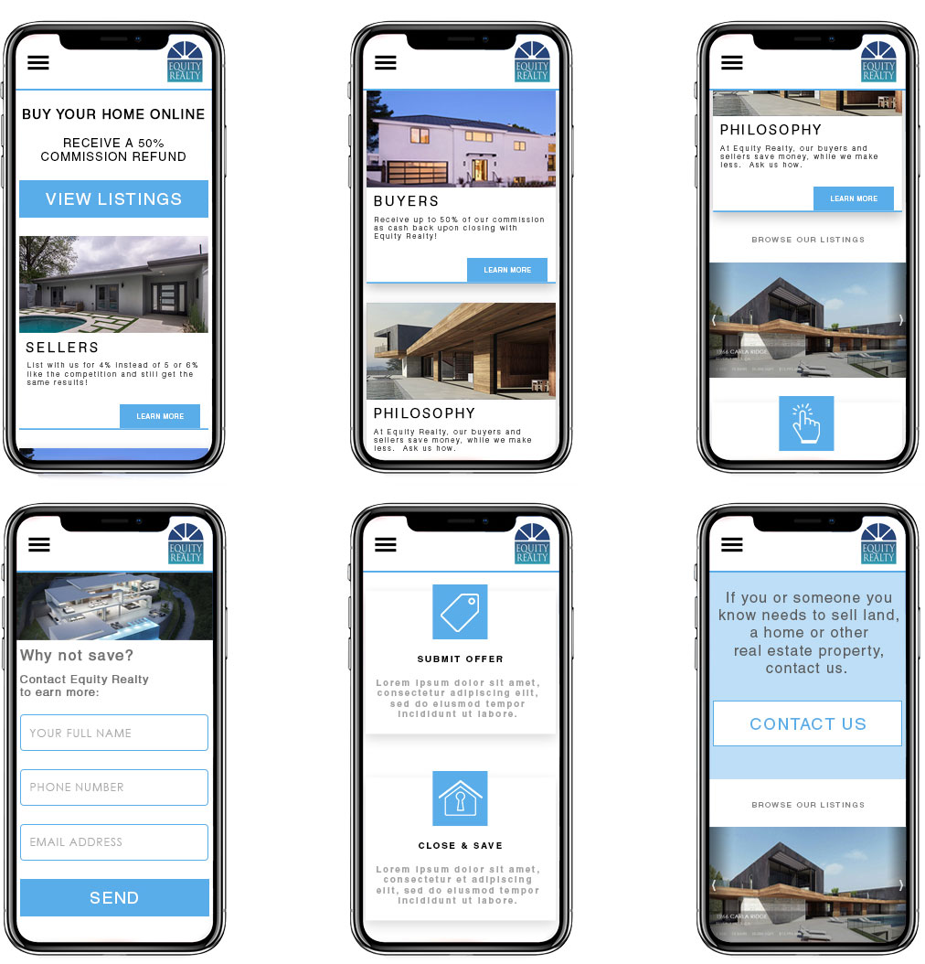
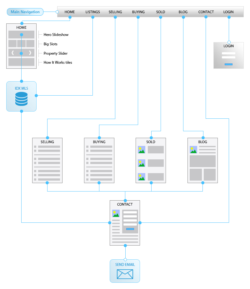
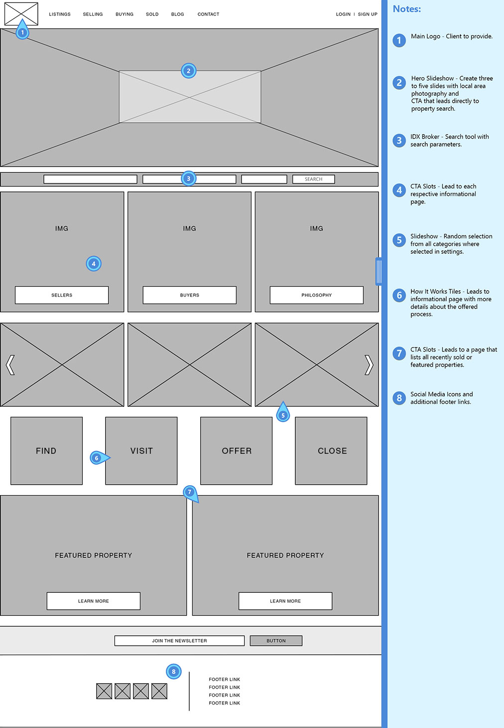
Because the old website is built on WordPress, and because that site lacks the details needed to make it look clean and professional, Equity Realty chose to go with a 100% custom solution. This new custom website needs to be fully-responsive for mobile, and needs to display listings pulled directly from a regional MSL database. Some of the tools used to do this are to include connectivity via IDX Broker, which taps directly into the MLS and allows the results to be formatted according to the website design. Furthermore, I'm using typical Open Source languages to develop the site, such as HTML and CSS, JavaScript, PHP, and MySQL for any database items that were needed. Additional tools used to create the flow, wireframe, and additional items include Photoshop and Sketch App.
UX Research
When interviewing the client, the goal was simple. Get visitors to contact Equity Realty. Because we aren't selling products on the website, the end goal is to provide basic information about the services offered, and then lead users to the contact page; thus, in the interest of conversion, all routes lead to the contact form.


Visual Design
Color Scheme
During the interview process, we did find some custom sites that had nice styles, but we also found things we liked about some existing WordPress templates. For example, the blue theme matched up nicely with Equity Realty's existing logo. The need to show edge-to-edge, high-quality imagery was extremely important, and the iconography needed to speak to the process in addition to any verbiage provided. The layout needed to take advantage of today's high-definition monitors, but then easily scale down to look just as great on mobile devices.

