SQL MDS
Microsoft Office Design Group
UI Design | UX Research | 2009 - 2010
Background
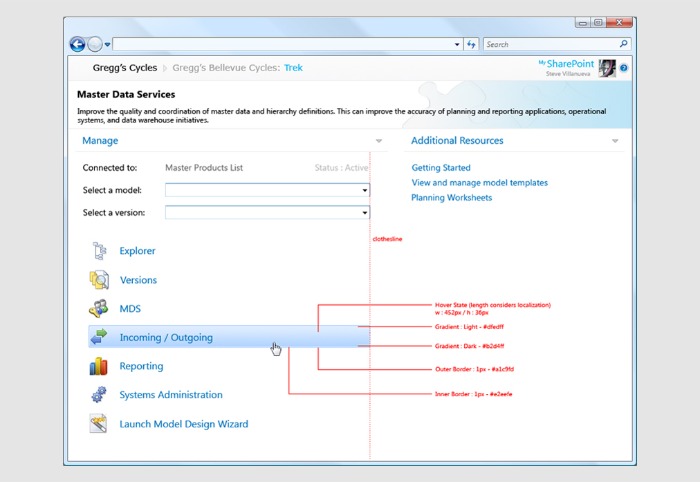
Microsoft defines Master Data Services as the ability to manage a master set of your organization's data. You can organize the data into models, create rules for updating the data, and control who updates the data. With Excel, you can share the master data set with other people in your organization. Originally purchased from a 3rd party by Microsoft, MDS was to be packaged as an option that would ship with SQL Server. Because the original team that developed the product had no design experience, the product as it was when purchased was extremely Web 1.0 in it's interface design (or lack thereof). SQL Group wanted to make MDS look as if it were a Microsoft Office product, and that's where I came in.
Tools & Technology
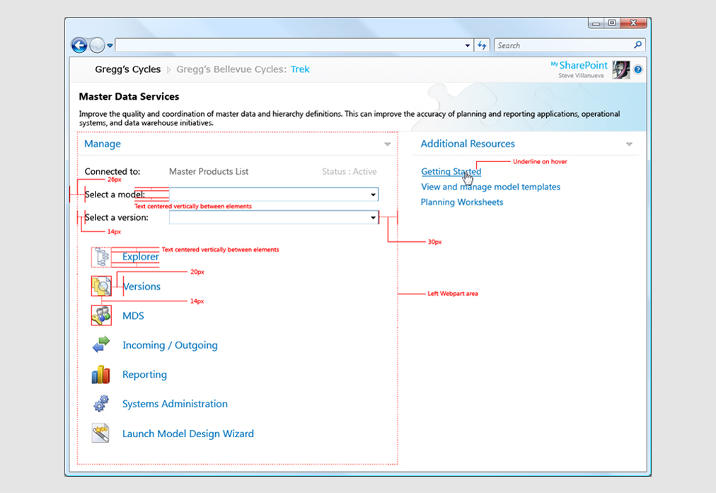
When putting together concepts for this new UI, I consulted closely with developers and artists from both the Microsoft Office Design Group and SQL Server with the intent to adhere to Microsoft's latest UI standards. Some of the tools required to do this were Photoshop and PowerPoint for creating assets and concepts, as well as ASP, .NET, JavaScript, and a lot of CSS and HTML. I used Visual Studio 2008 with TFS to implement my UI designs.
UX Summary
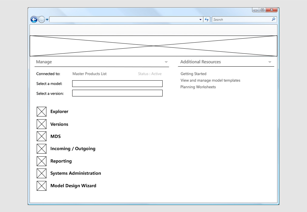
When researching the best way to implement the new UI, I engaged in the following tasks:
- Met with Project Mangers to discuss the expected direction of UI elements.
- Met with UI Designers and Developers at ODG to discuss UI Guidelines and MS standards.
- Created MS Project documentation to outline deliverable deadlines and costs.
- Created flow charts using MS Visio.
- Created simple personas to emulate user interaction with SQL MDS.
- Created high-fidelity prototypes, including motion studies where applicable (Photoshop & Flash).
- Performed user testing in Microsoft's usability labs.
- Implemented final UI elements using Photoshop, HTML, CSS, JavaScript, and .NET.
- Worked with Development to integrate new UI elements into the final build.
Visual Design & Branding
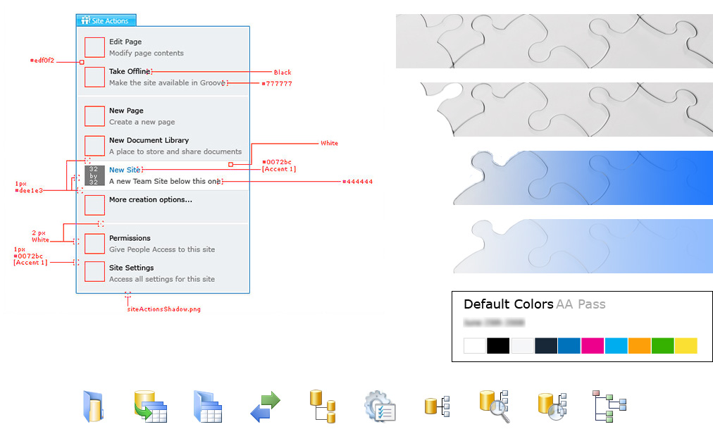
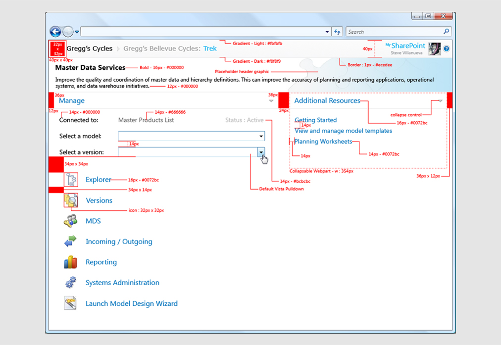
I was the sole UI Designer for the 1.0 version of this product, creating the overall look and feel, including buttons, menus, icons, wizards, and most functional dialogs. The end product was to be software that looked like a natural Microsoft product. Because MDS had to look like a Microsoft product, it was necessary for me to follow extremely strict UI guidelines. Common functions that were found in other Microsoft productivity tools needed to look extremely similar, if not exactly like those found elsewhere in the Microsoft ecosystem. For example, simple functions like Copy and Paste had to use the same icons, or types of icons as those found in Microsoft Office.
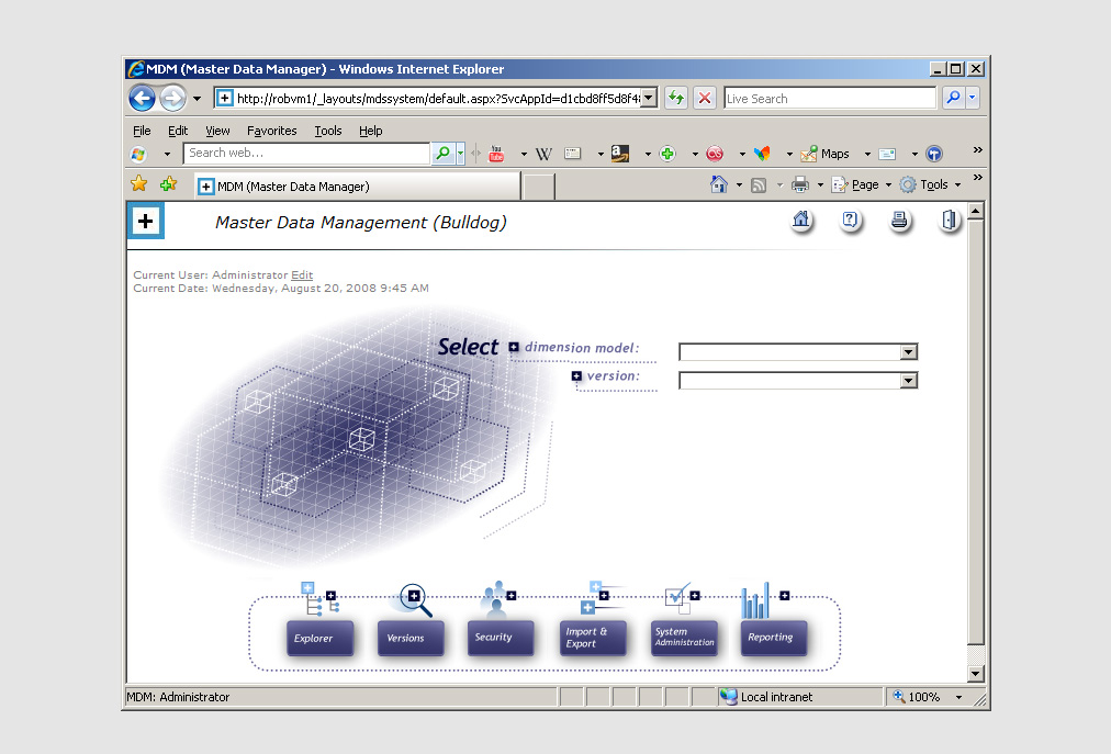
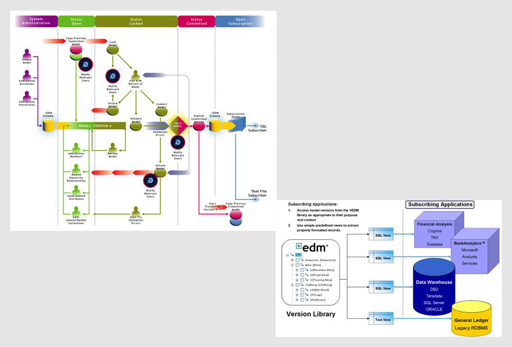
MDS - Pre Microsoft
This is how MDS looked at the time Microsoft purchased the product, and prior to my UI/UX enhancements.

Branding
Because MDS had to look like a Microsoft product, it was necessary for me to follow extremely strict UI guidelines. Common functions that were found in other Microsoft productivity tools needed to look extremely similar, if not exactly like those found elsewhere in the Microsoft ecosystem. For example, simple functions like Copy and Paste had to use the same icons, or types of icons as those found in Microsoft Office.


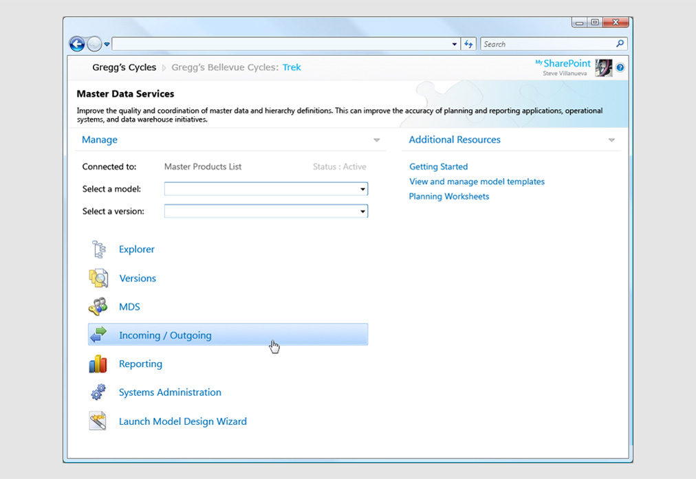
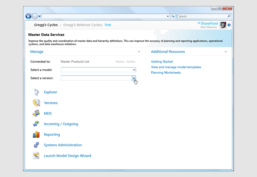
MDS - Post UI/UX
This is the completed redesign after my UX Research and UI Design.
